New Kaizen Insight release for iPad

At Kaizen, we continuously work on improving our application to give the best performance and enhanced ease of use. As the software engineer responsible for Kaizen Insight app and its operation, I would like to explain the improvements made for this latest version just released in the App Store.
We have given Kaizen Insight a complete make-over. We were happy with the visual aspect of the previous version, however, after analysing user feedback we saw a chance to improve navigation and accessibility, so we got to work on it.
First of all, we rethought the entire main screen. The navigation options used to remain hidden while some small labels indicated at all times the scope of what you were seeing: the product, the sales force, the period... We decided that it would be better if all options were visible at all times, both to select and to show.
The solution? The navigation options on the left-hand side drop down with a single touch.
With this design decision, we resolved two problems: the visibility in the analysis area and the option selection. It is now much more dynamic to check data by product, period, etc. And more important yet: we don't hide the solution possibilities and improve the user experience considerably.
We have to bear in mind that in this version we also added a walkthrough (accessible via the Help button) and an option to select the month on which we want to base the data analysis.
Up until now, we could only see the current month, now we can also work on historical data that we already stored in our database. The design of our database allowed a non-traumatic change which could be implemented quickly.
On the other hand, we also changed the navigation. Before, the application forced us to see the KPI’s of the selected element on the treemap to be able to navigate its dependent elements. We have made everything much more fluid.
If you want to navigate on the treemap and get as deep as you want, you can do it with very few touches. It is even fun to go up and down among the treemap elements.
We have added an access tab for the KPI’s and now the comparative analysis between the various metrics is much faster.
At the top of the screen we have added a header that allows you to know what element of the sales force you are in, in addition to the useful information summary; this way, whenever you access your KPI’s you will be able to see the territory you are analysing at all times.
For example, if we take a look at Robert Kutcher:
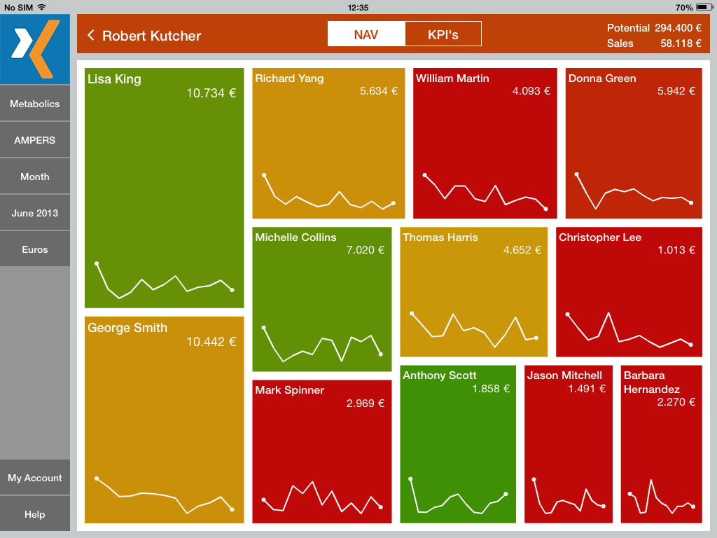
In the NAV (Navigation) section, Robert Kutcher can see all the reps he manages and if he clicks on each one of them, he will be able to see the related territories. At a glance, he will see graphic alerts, thanks to the colour coded treemap and the information provided, which indicates what territories are in trouble.
It is a very useful way of focusing the analysis on those areas that can be improved, spotting first in a simple, graphical way where the trouble is.
kaizen for pharma KPI benchmark charts If he wants to go into further detail, he can go to the KPI's tab and access the graphs and figures of each one of them and get more in-depth information.
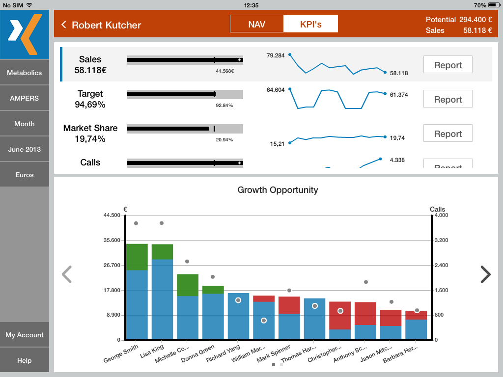
He will be able to see where things can be improved and what margin must be attained to get the most performance and efficiency out of each one of the territories.
The entire new navigation and this way of working have another important pillar on which rests the development of this new release: flow and performance.
None of this makes sense if the response time of the application is not fast enough. So we focused on offering a user experience as light as possible, making animation and navigation quite fluid.
Performance improvements
The main figure to measure the performance of a video game is the refresh rate; this is no different for apps. If the refresh rate is high, the user gets the feeling that everything flows very dynamically. There are no slowdowns or twitches and the user experience is very good.
The app is designed to be able to run smoothly even on the former iPad 2. We use this device as a reference because of its memory and processing limitations: if we could make it run smoothly on an iPad 2, on any later iPad it would run even smoother.
Keeping a refresh rate between 30fps and 60fps was our priority. Once we spotted issues using profiling tools, we implemented solutions testing as many times as necessary until we felt satisfied with the work we had accomplished.
Additionally, the data loading response time had to be equally fluid. It is 2015 and access to information has to be instantaneous. Everything has to run at the same speed; navigation and data access. That is why Kaizen Insight works offline and each user gets the information they need.
The Big Data repositories are in the cloud. Daily work is offline – new data packages are downloaded automatically whenever there are updates available – and therefore users only access their previously calculated and segmented information, which appears much faster on their screen.
New releases
Of course, we continue working to offer new features and to improve Kaizen for Pharma every day. Our work is primarily based on the feedback from our users. Not only at the backend level, but also at other levels such as graphics and innovative ideas that can make the Kaizen experience even more complete.
We are excited about the technological challenges ahead of us to offer the best user experience and the highest added value for the pharmaceutical industry.